Of course there are several options to get your content scaled on the center of your stage in the maximum size without distorting your content:
- Using just background images with focal point
- Creating a „safe space“ with CSS
- Creating a „safe space“ with pure JavaScript
Background Images
Using pictures as background is easy. With the new „focal point“ function in Google Web Designer, you just drop an image on stage, make it „Crop image to fill“ in „Image > Scaling“ and so unlock the focal point option.
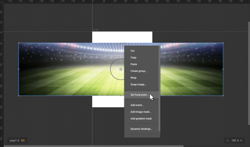
With this option, Google Web Designer automatically scales the image to cover the whole canvas while remaining its aspect ratio. Instead of just showing the center, the focal point forces the image to show the selected center point, to guarantee it is visible in any canvas size.
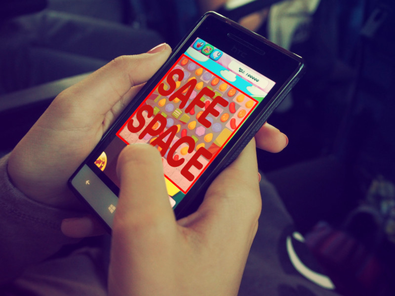
Safe Spaces – Centered Interactive Background without images (CSS)
But what happens, if you need a specific space with content in it, that always needs to be displayed on the canvas, independent from its size, e. g. for having interactive content? Then it’s getting slightly complicated.
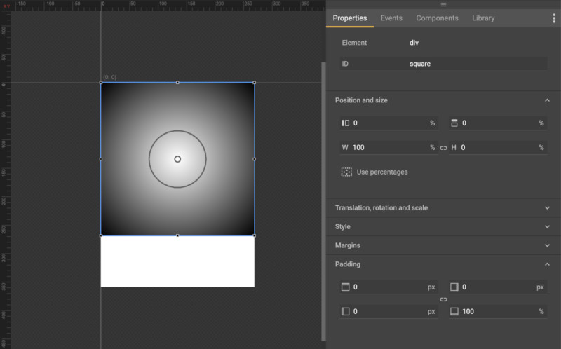
In this example, we want to have a square, which will always be fully displayed in its maximum size dependent of the screen format in the top left corner.
For portrait mode, this is easy to do:
- Create a square with the following display options:
left: 0%;
top: 0%;
width: 100%;
height: 0%;
- Go to „Padding“ and set padding-bottom: 100%
For landscape mode, it’s getting a little bit more complicated: We’ll need some CSS „hacks“ to help here, but luckily Google Web Designer allows responsive layouts, so we go to the Responsive tab and click in the right icon next to the „[ ] Media Rules“ menu. and the Media Rules will change into Landscape and Portrait rules.
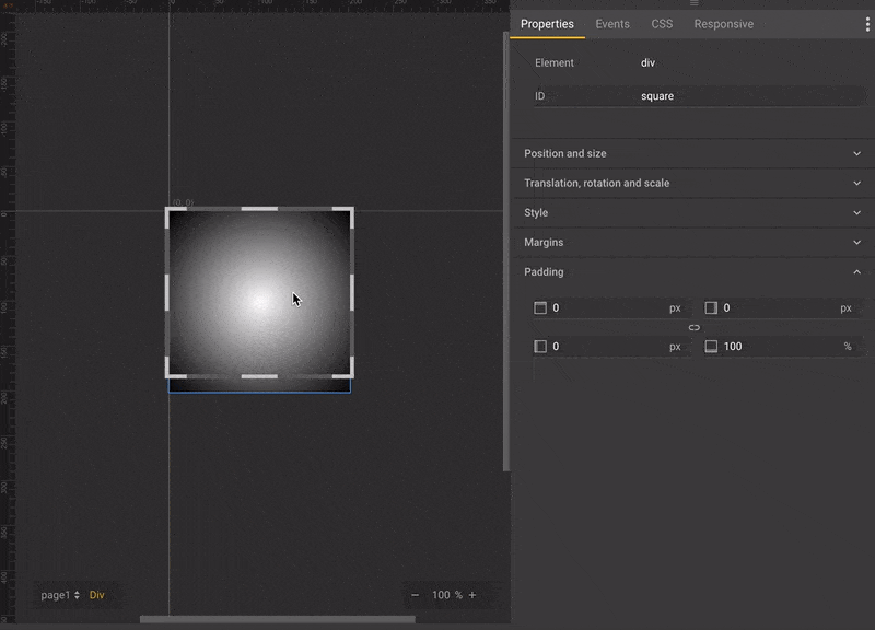
As we now want to change the landscape rules to keep the square always in its format, we select „Landscape rules“, turn back to the „Properties“ tab and do the following changes, either in the properties panel or directly in CSS:
height: 100%;
padding-bottom: 0%;
Finally, we change to the „CSS“ tab and add an additional property „width: 100vh„. „vh“ is for „viewport height“. This is not part of native Google Web Designer, but through CSS luckily available on any mobile Browser according to caniuse (except of Mobile Opera) and defines, that its height should have 100% viewport height.
So, what can we do now with this safe spaced square?
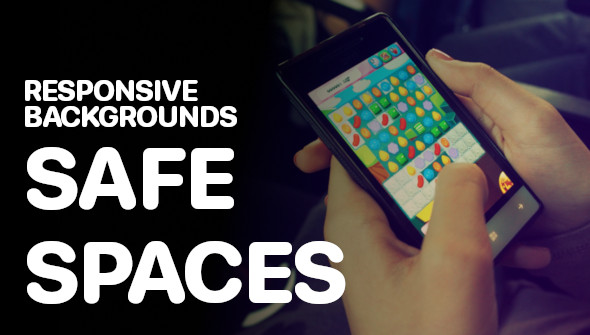
We can fill in percentage based content and so e. g. create small games, where we know, that the main part always has to be visible. The rest of the screen (outside of the square) can be used for decoration, the user interface, the scoreboard, the background images etc. like in the following example:
Safe Spaces – Centered Interactive Background without images (JavaScript)
The easiest solution is creating a div container with the tag tool, name it „safespace“ and adding the following JavaScript code on „Ready to present page“:
var v = gwd.actions.events,                   /* just a shortcut */
    s = v.getElementById("safespace"),        /* shortcut for our safe space */
    p = s.parentNode,                         /* shortcut for stage */
    dW = p.offsetWidth / s.offsetWidth,       /* get difference of safe space width and stage width */
    dH = p.offsetHeight / s.offsetHeight,     /* get difference of safe space height and stage height */
    factor = (dW > dH ? dH : dW),             /* find max scale size for perfect fit*/
    sW = s.offsetWidth * factor,              /* calculate new safe space width */
    sH = s.offsetHeight * factor;             /* calculate new safe space height */

// set new style for safe space
v.setInlineStyle("square", "transform-origin:0 0; top: " + ((p.offsetHeight - sH) / 2) + "px; left: " + ((p.offsetWidth - sW) / 2) + "px; transform: scale3D(" + factor + "," + factor + "," + factor + ")");

// if stage size changes, call this function again
window.addEventListener("resize", arguments.callee);
That’s it. Not very GWD native, but the easiest way to solve this.
The big advantage of this solution is, that you can create everything within the safe space based on pixels and not on percentage, because the stage just gets scaled. Be careful: On very big scale it might happen, that some parts get blurry.