One of the coolest things with Google Web Designer is the ability to create your own components. As this is getting more and more important, the longer you work with this tool, I’ve decided to investigate into the implementation and development of a custom component and share my results with you.
It’s always good saving some kilobytes within a project and one of the most useful techniques is using sprite sheets instead of several images.
Advantages:
- less kilobytes due to missing heap of several headers
- only one file to load (the more http requests, the more time goes by, no need to wait for several files)
- file reduction, especially for standard ads, were the limit of total files is 10
Disadvantages:
- not so easy handling
- can be handled with GWD natively only with nested divs and overflow:hidden
That’s why I’ve decided to bypass the disadvantages by creating a Sprite Sheet Component.
Minimum Complexity:
- manifest.json
- spritesheet.js
The manifest.json is necessary for the communication between Google Web Designer and the javascript. What we define in here will be visible in the component options.
Within spritesheet.js, there is the code for registering the objects from the HTML code in Google Web Designer. Also part of the code is the implementation of the sprite sheet itself. Usually it’s better having a separat javascript files for a better code overview, but as this component will be very small, we keep everything in one javascript file.
There are 2 ways of implementing a sprite sheet in HTML / Javascript:
- using CSS with clipping and changing background image position
- writing the defined part of the image into canvas
To keep memory usage low, I’ve decided to go the canvas way, as it allows us to delete the image after copying the part to canvas, where in CSS it needs to be kept in memory all the time.
Step 1: Create the component
Within the code view, our sprite sheet component should look like that:
<img-spritesheet>…</img-spritesheet>
For finding a great name, it’s important to know, that per definition for custom tags, a dash in its name is necessarily needed, otherwise the browser will think, that it’s a native html5 tag and will throw errors. For those browsers, who still don’t know those custom tags, Google Web Designer adds a polyfill automatically.
Actually with all options set, our tag later will look like that:
<img-spritesheet id="" image="" sx="" sy="" swidth="" sheight="" src=""></img-spritesheet>
Step 2: Generate the interface
Next, we want to create the design of the component inspector for our sprite sheet component.
First of all, we need to define, which values are needed to create a proper image clip.
Of course, we’ll need:
- url of source image
- x (left position of clipping)
- y (top position of clipping)
- width (of clipping)
- height (of clipping)
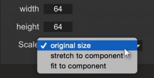
And to make our component more flexible, we should add an option, whether the clip should be scaled to the components size (by keeping the format size), stretched to the component (which can cause distortion) or always keep its original size (default).
![]() This can easily be achieved by creating the manifest.json, which is nothing else than a JSON-object, that Google Web Designer is able to parse and assign the keys and values to the component inspector.
This can easily be achieved by creating the manifest.json, which is nothing else than a JSON-object, that Google Web Designer is able to parse and assign the keys and values to the component inspector.
Before we’ll have a closer look to those keys, we need kind of a header, which contains all the meta informations, that GWD will need, e. g. the name or the tag name and type of our component:
E. g.
{
   "name": "Spritesheet",
   "type": "img-spritesheet",
   "tagName": "img-spritesheet",
   "version": 0.1,
   "description": "Displays part of an image",
   "files": {
      "js": [
         "spritesheet.js"
      ]
   },
   "attributes": [],
   "events": [],
   "methods": [],
   "nestable": true
}
This is the very basic manifest.json. It contains the following data:
- name: the name of our component
- type: the type of the component
- tagName: the nodename of our component (as defined in step 1)
- version: the current version of our component (important for later updates)
- description: a short description, what our component can do
- files: an array with all needed files, except of the manifest
- attributes: all the parameters, which should be shown by the component inspector later, can be added here
- events: all events, that can be targeted in the events panel with our component can be defined here
- methods: all methods, that the user can do with our component, can be defined here
- nestable: a boolean value, whether the user can put objects into the components DOM structure or not
To make our component inspector show something, we’ll focus on the attributes part now:
To let the user define a width and height for this clip, we need to add the following array to the attributes array (to avoid confusion about the width of the component in the code and the variable, I named the attribute sWidth instead of width and sHeight instead of height):
"attributes": [
   {
   "name": "sWidth",
   "label": "width",
   "type": "number",
   "required": true,
   "defaultValue": "64",
   "description": "sprite width"
   },
   {
   "name": "sHeight",
   "label": "height",
   "type": "number",
   "required": true,
   "defaultValue": "64",
   "description": "sprite height"
   }
]
In this case, they keys mean:
- name: name of the attribute, which also will be shown within the tag and which will act like a variable in our components code
- label: this is label, how Google Web Designer will present the key in the component inspector
- type: type of the value, e. g. string, number, boolean etc
- required: boolean value, whether a value is needed to make the component work or not
- defaultValue: if the user doesn’t add a value, we can define a default value, which will also be visible in the component inspector at the very beginning
- description: a short description, what this parameter means
If we need a specific type of input field, then a proprietary key named gwdSpecific comes into game and overwrites the type values:
"gwdSpecific": {
   "label": „"Image",
   "sync":   "src"
}
This causes being the value synced with the src-attribute of our component, which makes Google Web Designer register the linked file and being added to the published content, which wouldn’t be the case if a simple type string was used.
Another interesting gwdSpecific attribute is the dropdown type, which looks like the following:
"gwdSpecific": {
 "type": "dropdown",
 "items": ["original size", "stretch to component", "fit to component"]
 }
This generates a dropdown menu for the component inspector, where the user then can select between the options in the items array.
As we just want to create a simple component, we won’t need events and methods in our first step, we’ll add them later.
Finally, this is how the manifest.json looks like:
{
   "name": "Spritesheet",
   "type": "img-spritesheet",
   "tagName": "img-spritesheet",
   "version": 0.1,
   "description": "Displays part of an image",
   "files": {
      "js": [
         "spritesheet.js"
      ]
   },
   "attributes": [
      {
      "name": "image",
      "label": "Source Image",
      "type" : "string",
      "required": true,
      "description": "Source sprite sheet",
      "gwdSpecific": {
         "label": "Image",
         "sync": "src"
      }
   },
   {
      "name": "sX",
      "label": "x",
      "type": "number",
      "required": true,
      "defaultValue": "0",
      "description": "top left x position of sprite"
   },
   {
      "name": "sY",
      "label": "y",
      "type": "number",
      "required": true,
      "defaultValue": "0",
      "description": "top left y position of sprite"
   },
   {
      "name": "sWidth",
      "label": "width",
      "type": "number",
      "required": true,
      "defaultValue": "64",
      "description": "sprite width"
   },
   {
      "name": "sHeight",
      "label": "height",
      "type": "number",
      "required": true,
      "defaultValue": "64",
      "description": "sprite height"
   },
   {
      "name": "sScale",
      "label": "Scale",
      "type": "string",
      "required": true,
      "defaultValue": "original size",
      "description": "sprite scale behavior, according to component size",
      "gwdSpecific": {
         "type": "dropdown",
         "items": ["original size", "stretch to component", "fit to component"]
      }
   }
   ],
   "events": [],
   "methods": [],
   "nestable": true
}
For learning how to implement the necessary javascript code, please continue with this tutorial.


Do you know of a list of gwdSpecific types and fields that are available? I have not found any resources regarding that.
Hi Peter,
the only documentation I know, is this one: https://support.google.com/webdesigner/answer/6172389?hl=en&vid=1-635757592191960429-1973122199
But I know some of the gwdspecific ones by crawling through the published code, but unfortunately I don't have a full list.
"type": "textbox"
"type": "dropdown"
"type": "boolean"
also important:
"advanced": true // which make this specific attribute appear in the advanced settings window
I'll write a post as soon as I am having more information about gwdSpecific types.
Cheers,
Patrick